
What is MySugr App:
The MySugr app is a diabetes management app designed to help people living with diabetes track and manage their daily health data. It simplifies diabetes management by integrating key features that help users monitor their blood sugar levels, insulin intake, and lifestyle habits.
My role:
As a UX/UI Designer and Researcher, I engaged directly with current users to address their concerns about the report page. I incorporated their feedback into the design to ensure a smooth workflow. Additionally, I conducted usability testing as the moderator, ensuring that user insights were integrated into the final experience.


Timeline
Role
Tools
Team
2 weeks
UI | UX Designer & Researcher
Figma, Photoshop
Group of 2
Problem statment
Users of the MySugr app have expressed dissatisfaction with the report page due to its lack of customization options and user-friendly design. Specifically, users are unable to generate reports with a visual overview of their data for customized durations and specific content tailored to their needs. Additionally, the current design of the report page is perceived as unintuitive, making it difficult for users to navigate and extract meaningful insight
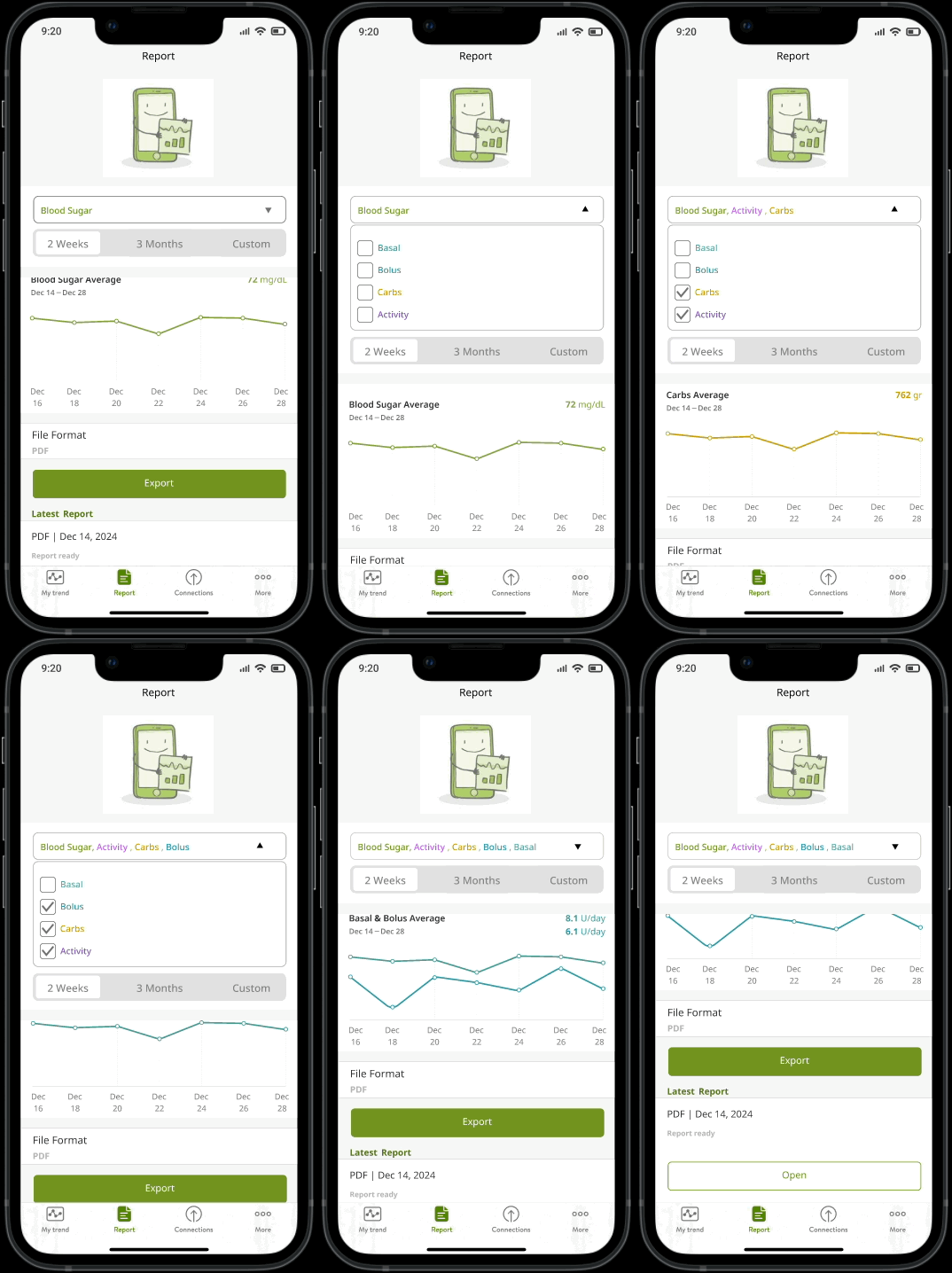
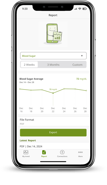
To address the issues identified with the MySugr app’s report page, we simplified the design to enhance usability and provide users with greater flexibility and control. The updated report page includes the following improvements:
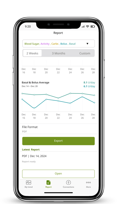
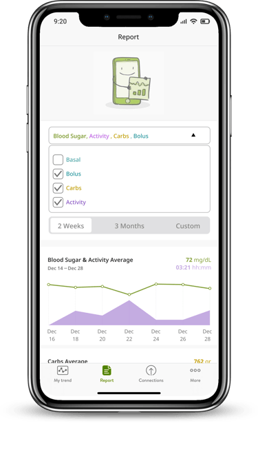
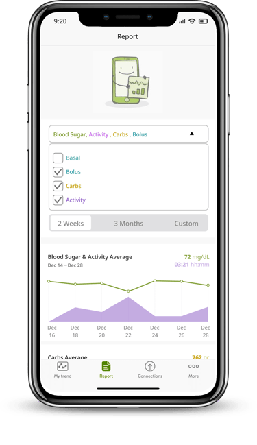
Customizable Parameters: Users can now add additional parameters (e.g., Basal, Bolus, Carbs, Activity) to their blood sugar overview, tailoring the report to their specific needs.
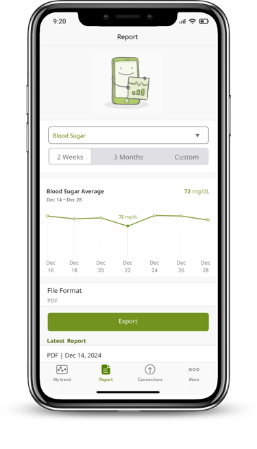
Interactive Visual Graphs: Before extracting a report, users can view an intuitive, consolidated graph that presents an overview of all selected parameters in a single visual, making it easier to interpret trends and patterns.
Streamlined Design: The layout of the report page has been simplified to ensure an intuitive, user-friendly experience, reducing the cognitive load and making navigation more seamless.
These enhancements aim to provide users with actionable insights, empowering them to manage their diabetes more effectively while improving their overall experience with the MySugr app
The Solution

Design Thinking
Interview
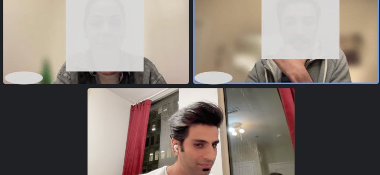
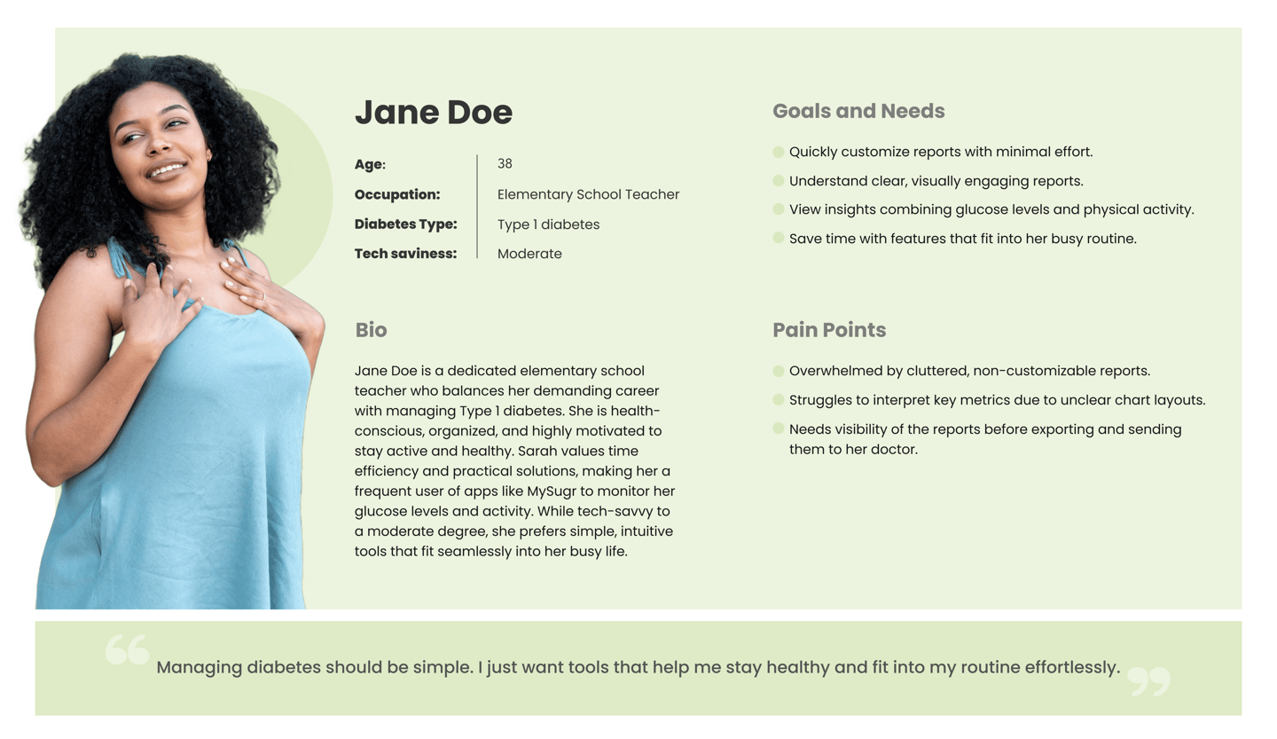
During interviews conducted with 6 long-term users of the MySugr app (each having used the app for over one year), several pain points were identified regarding their experience. A significant majority of the feedback centered on issues with the report page, which emerged as a critical area for improvement.



Key concerns raised by users :
Lack of a Visual Overview: Users reported the absence of an intuitive visual representation that consolidates their health data, making it difficult to interpret trends and insights at a glance.
Limited Customization Options: Users expressed frustration over not being able to select specific parameters (e.g., Basal, Bolus, Carbs, or Activity) to include in their reports, which limited the relevance of the information presented
These issues highlight the need for a more user-centric approach to the report page, focusing on customization and visualization to better meet users’ needs and improve their overall experience with the app.

Persona
Challenges in Implementation
One of the significant challenges was ensuring that users could see trends as graphs rather than raw numbers to better understand their glucose spikes. For example, understanding how physical activity impacts glucose levels requires a more visual approach.

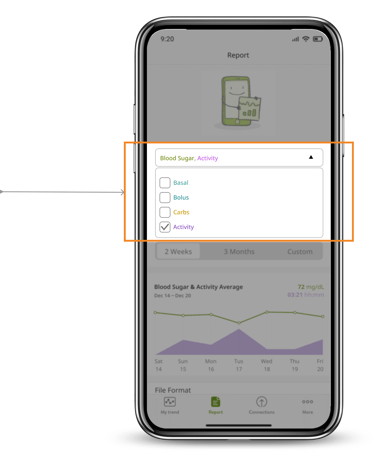
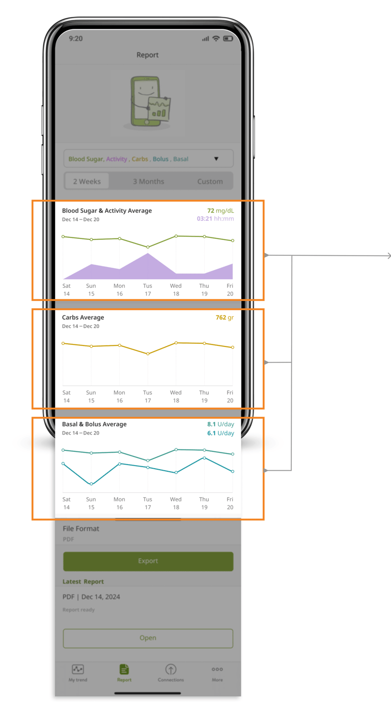
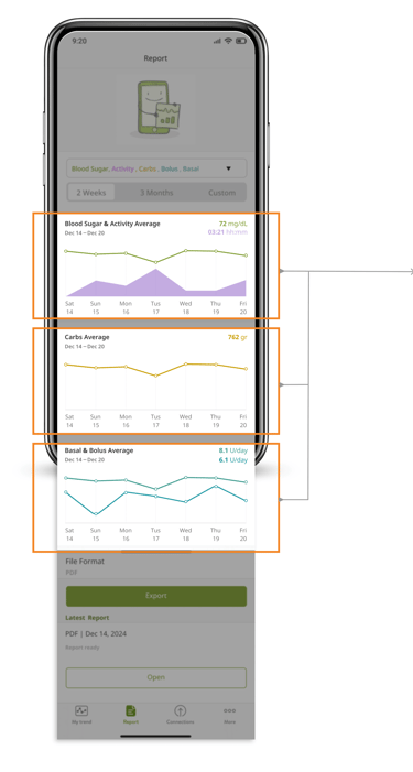
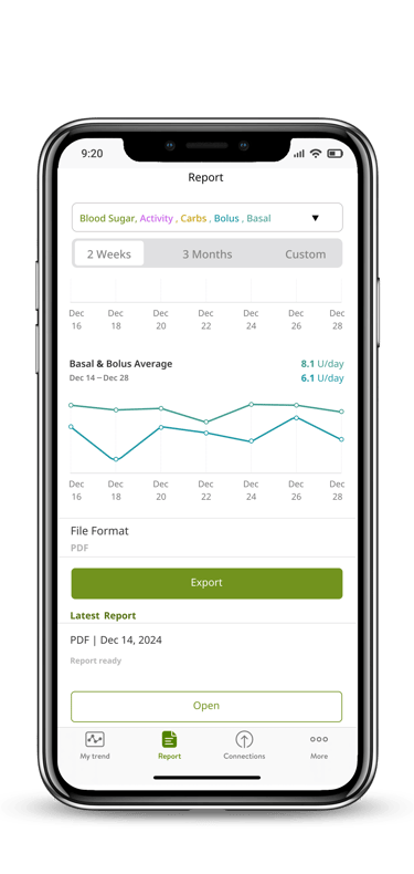
Customization Options: We added options for users to select parameters (Basal, Bolus, Carbs, and Activity) for each reporting period. However, the main challenge was managing different metrics with varying units, such as glucose levels and Basal insulin units, which couldn’t fit into a single chart.
Solution: During usability testing, we decided to display different charts for each metric in a stacked format within the same timeframe. This approach allowed users to view all relevant data without compromising clarity.
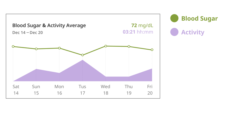
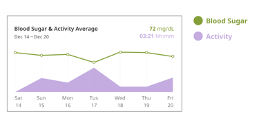
Activity Integration: Physical activity, being a qualitative factor, was incorporated into the main glucose chart. This helped users correlate their activity levels with glucose trends visually.

Final Wireframes

Reflections
What I have learned?
The crucial role of research in enhancing product effectiveness.
Collaborating within the team ensured timely delivery and meeting deadlines.
Testing and iteration imp[roved user-friendly.
Developing a UI kit ensured consistency and eased communication.
What Next?
The next steps involves working on the report output to see how easy is the flow for both the patients and doctors.
Following this, we'll enhance the user experience by conducting additional usability testing and iterations to refine the user flow further.
